Logo & Style Guide

Symbol Mark
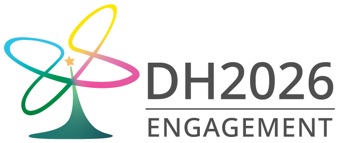
The symbol mark “Engagement” visually embodies the identity and vision of DH2026, by combining various motifs that represent Daejeon, Korea, and Digital Humanities.
Its primary motif is Hanbit Tower, an iconic structure located next to the DH2026 conference venue in Daejeon Expo Science Park. This motif symbolizes both the locality of the host city and the event’s aspirational spirit, representing knowledge, creativity, and the future-oriented growth of Digital Humanities.
The fluid curve surrounding the tower, inspired by the traditional Korean performance Sangmo Nori—or the spinning of ribbon hats during farmers’ music performances—expresses harmony, collaboration, and liveliness, reflecting dynamic interaction across diverse academic fields.
The multi-colored gradient, referencing Korea’s colorful traditional attire Hanbok, highlights DH2026’s openness and inclusiveness, embracing cultural and disciplinary diversity. The colors of the curve—yellow, blue, green, and pink—are vibrant versions of traditional colors that symbolize hope and harmony as they blend together. The base is a dark green, which represents Korea’s traditional love of nature and color aesthetics.
Under the theme of Engagement, the symbol mark conveys DH2026’s vision of global collaboration and practical solidarity in Digital Humanities.
Byeok
Hwang
Chorok
Jin-bunhong

Logotype
The logotype is one of the core visual elements that, together with the symbol mark, forms the foundation of the DH2026 Logo & Style system. It plays a key role in conveying the brand identity, consistency, and official character of the event.
Designed with a focus on visual harmony with the symbol mark and optimal readability, the logotype adopts a modern sans-serif aesthetic. It is based on Google’s Noto Sans typeface, which offers excellent legibility and versatility for international use across various media platforms.

